Documenting Peoples Environments and Possesions
The people without them being there
The people without them being there
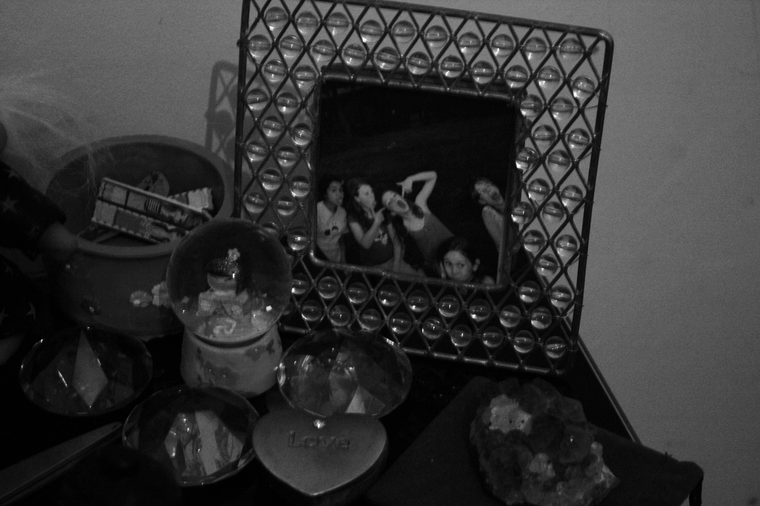
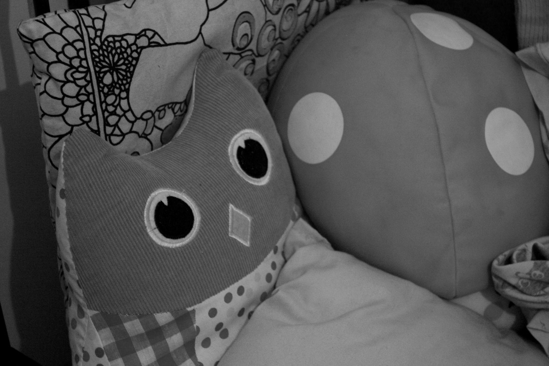
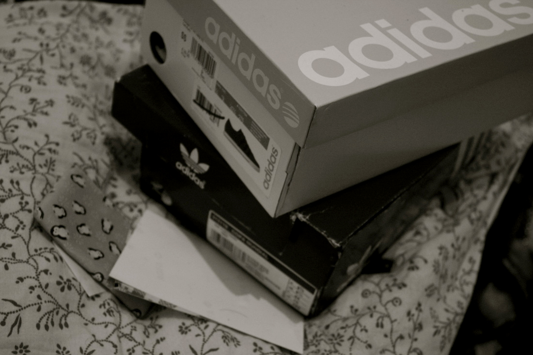
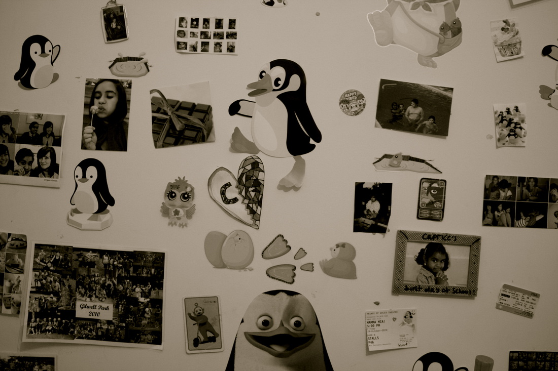
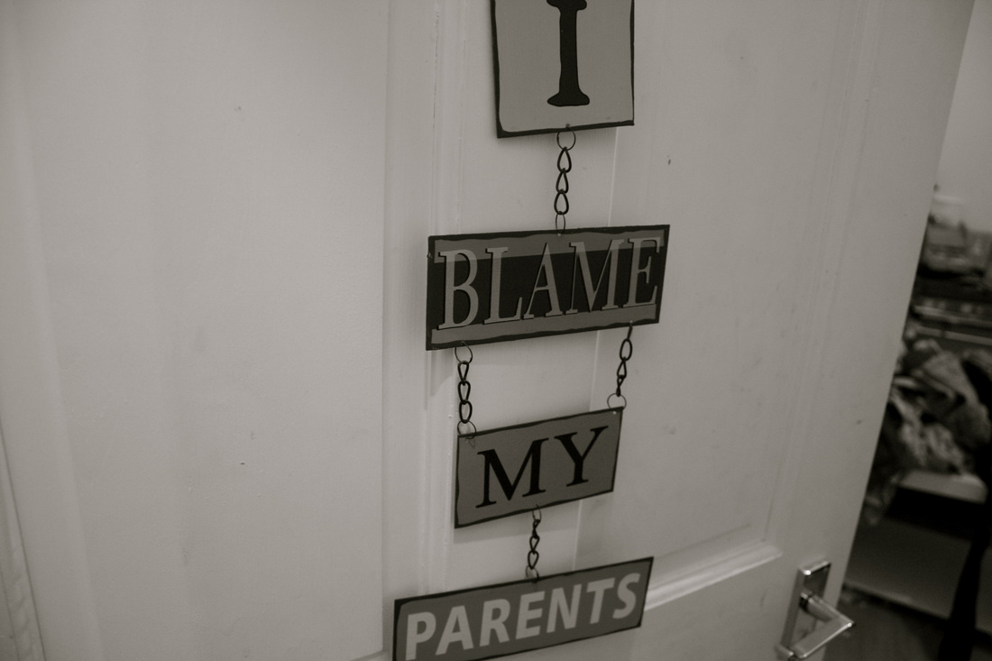
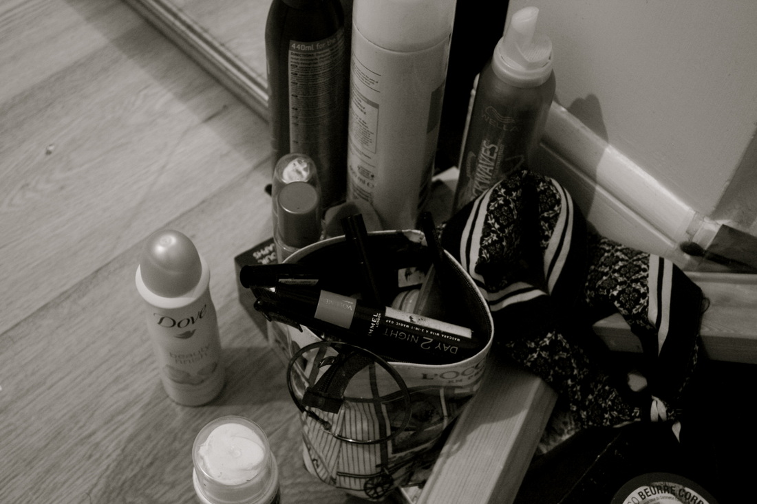
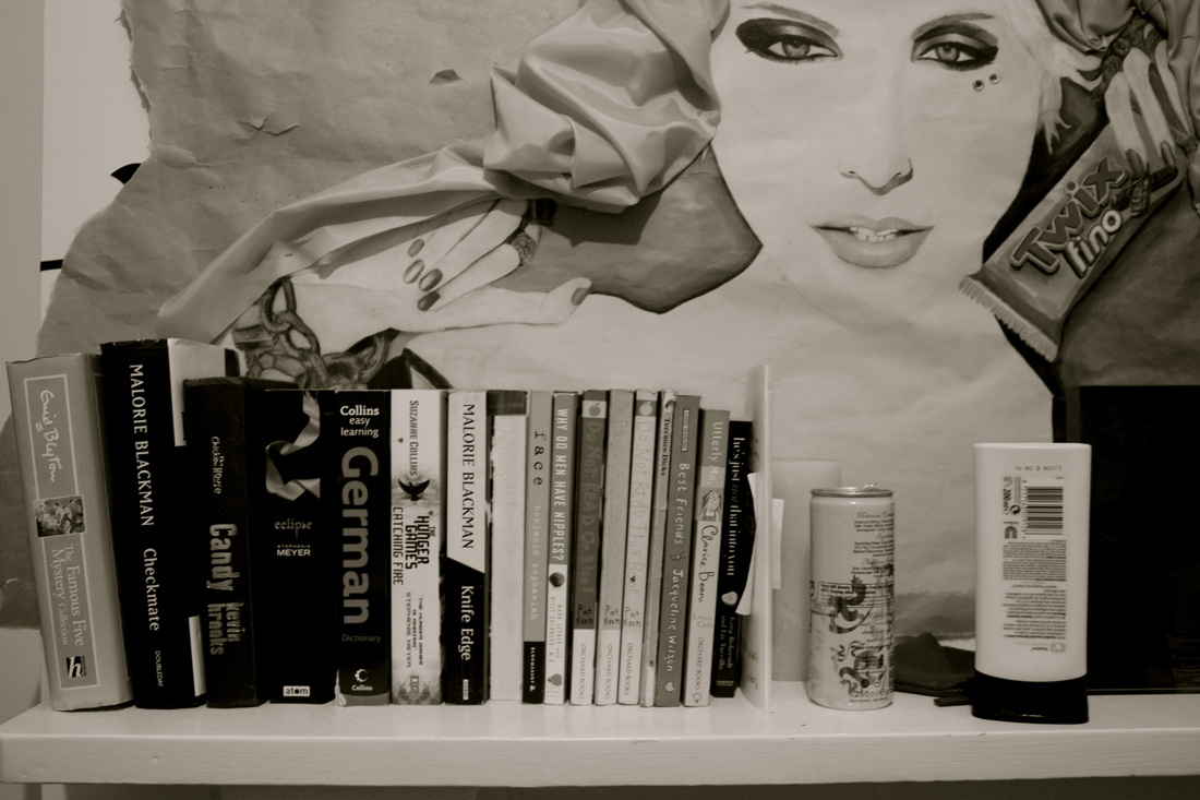
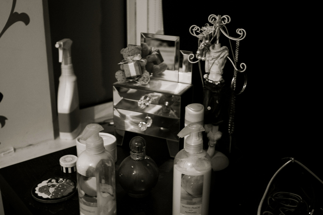
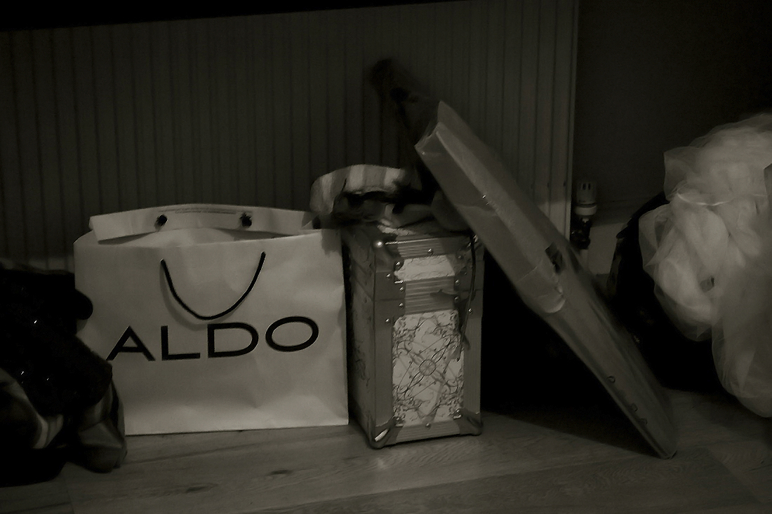
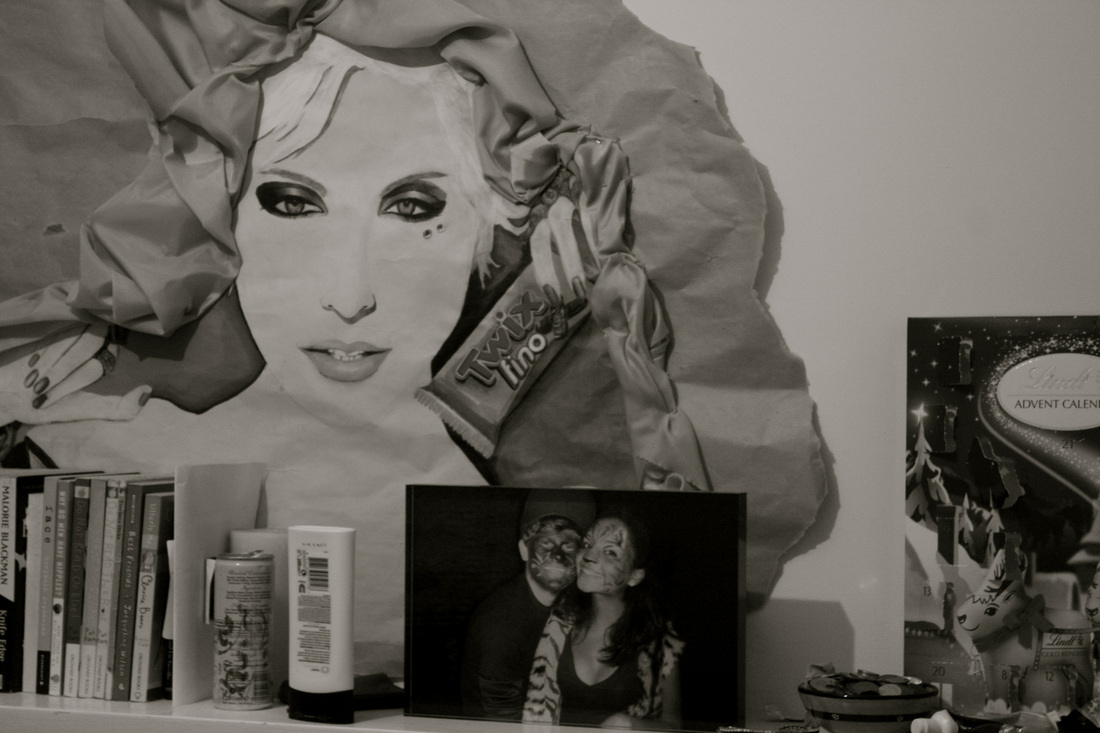
For this project I would like to do the opposite of what I achieved in Project 1. Instead of photographing the actual people I will aim to capture people and their lifestyles without them being there. To do this i will photograph their own possessions, their environments, their personal environments and even their traces that they leave behind. I hope to capture people and to be able to express who they are, what their personality is like, what they may look like or even what they're interests are all without them being there.
Nanna de Wilde, Kristina Stark & Terese Bolander
This collaborative project saw the photographers bring together ll the belongings of a deceased person whom they did not know personally. The aim of this ongoing project is to make a portrait and to investigate how much it is possible to learn about a person through their material legacy. They have measured and photographed all the items in her home item by item. www.dodsbo.com
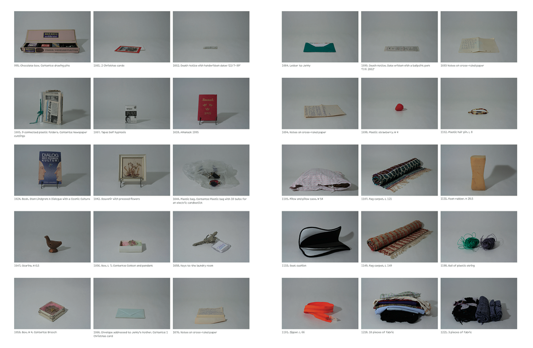
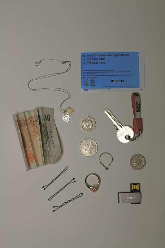
The fact that you can learn about someone just by looking at the objects that they own is facinating to me. From the photos above the photographers seem to have looked into someone who loves to read texts and loves different types of textures and materials due to the balls of wool and elaborate rugs. In repsonse to this task I will try and create the same impresson by photographing the things that people keep in their pockets. Hopefully this will gain similar outcomes to these of Nanna de Wilde, Kristina Stark & Terese Bolander and present the likes and personality of someone without them being there.
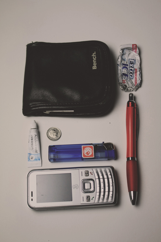
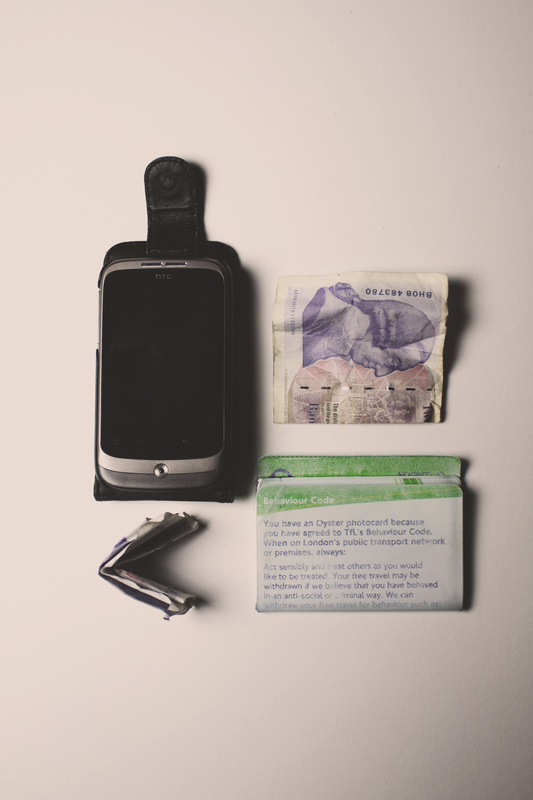
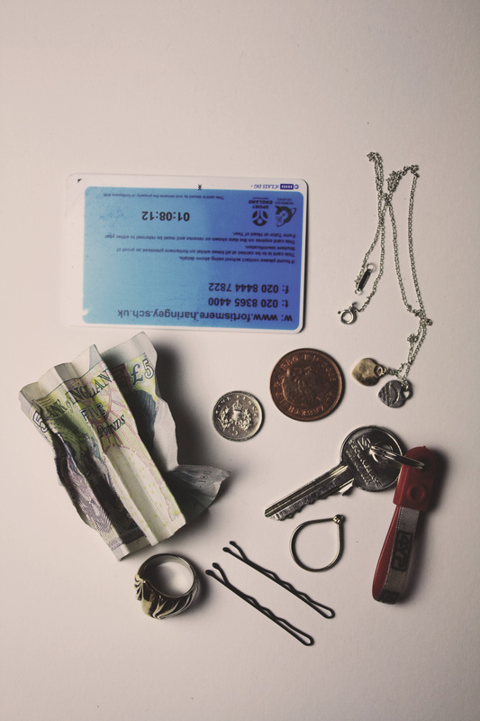
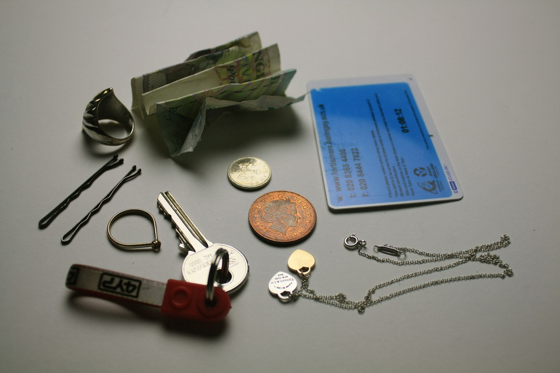
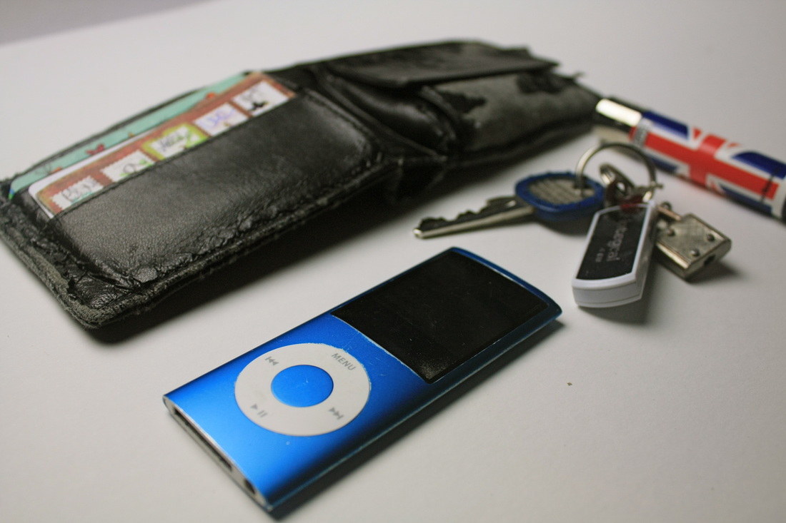
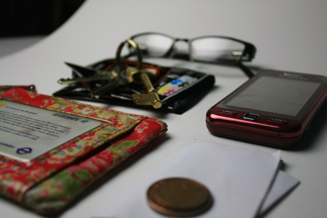
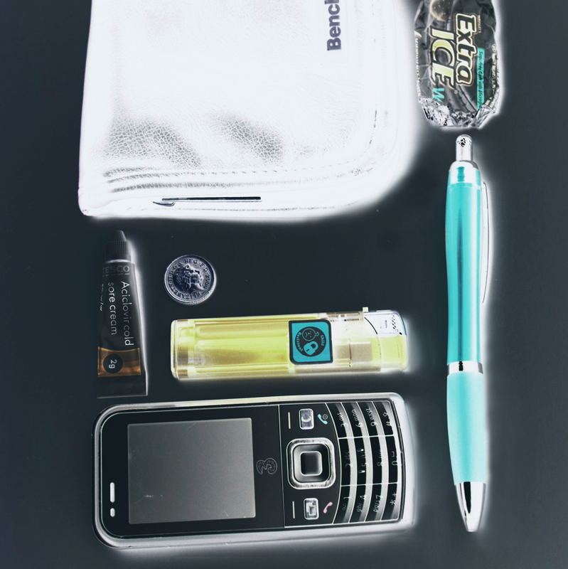
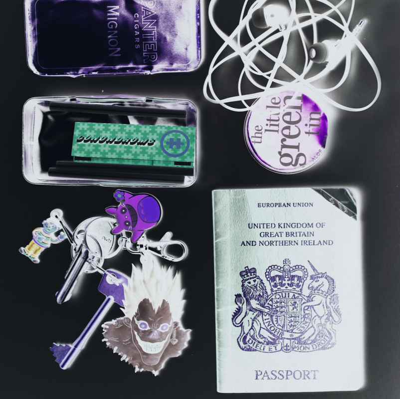
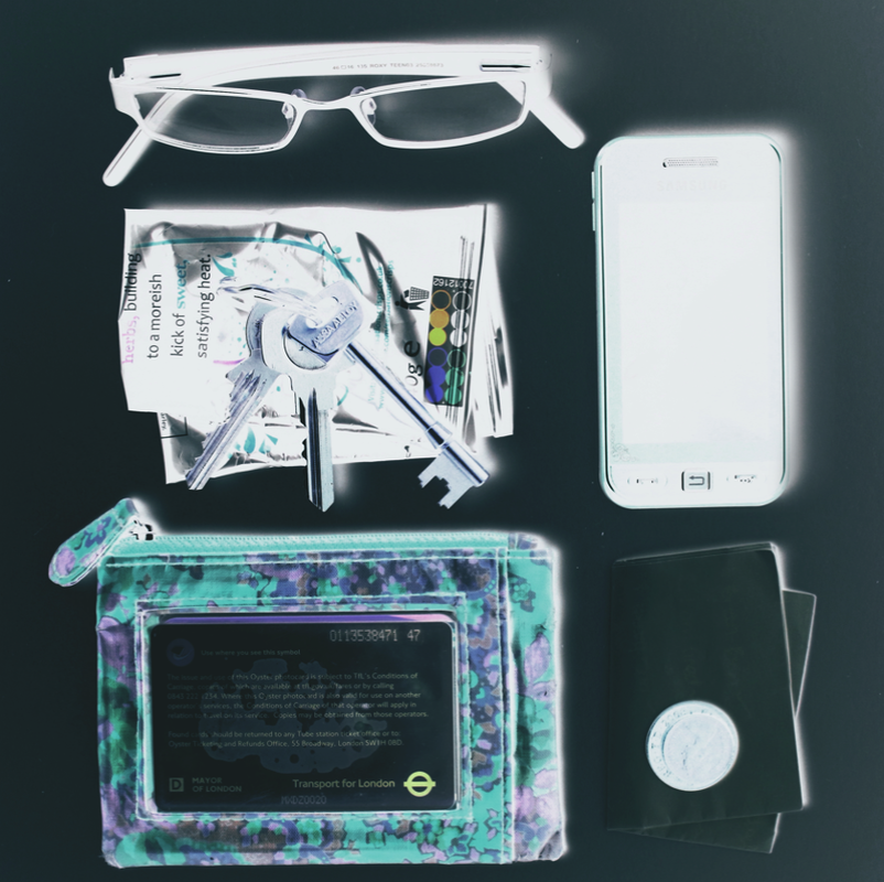
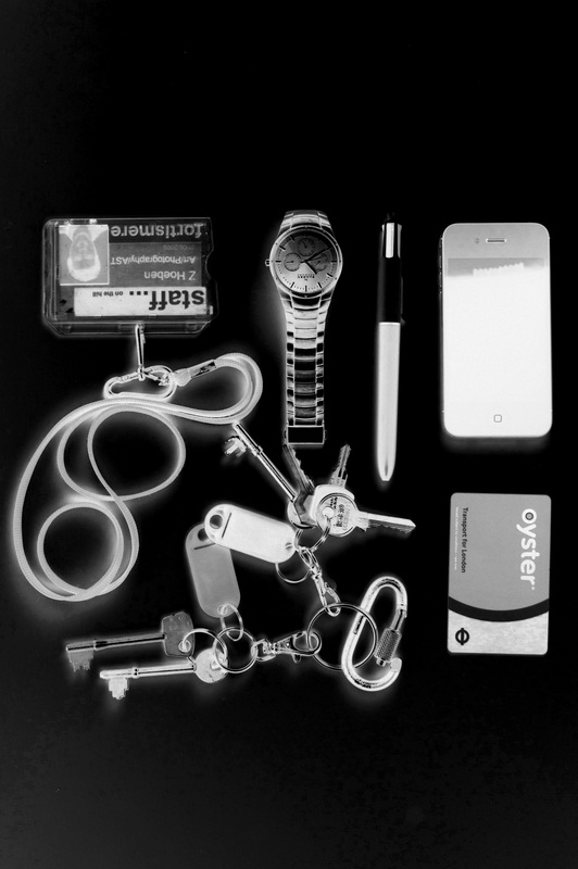
Set One: Emptying Pockets - Response to Nanna de Wilde, Kristina Stark & Terese Bolander


|
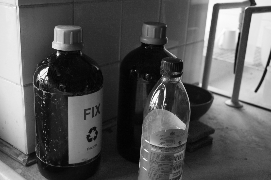
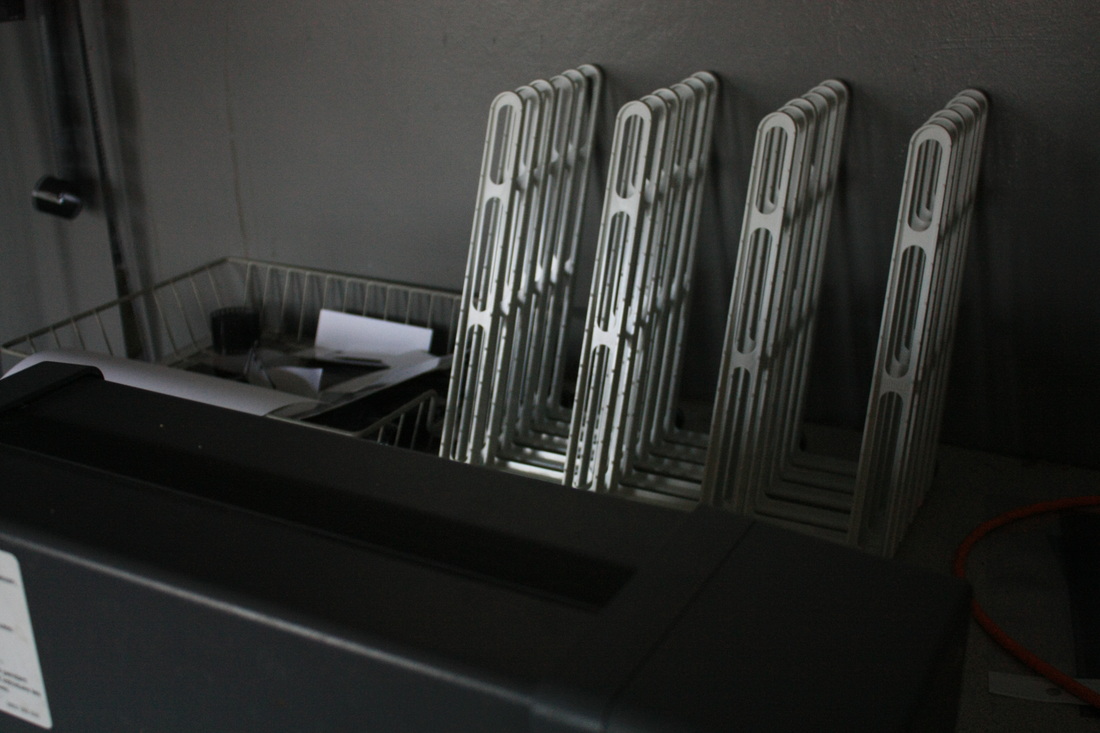
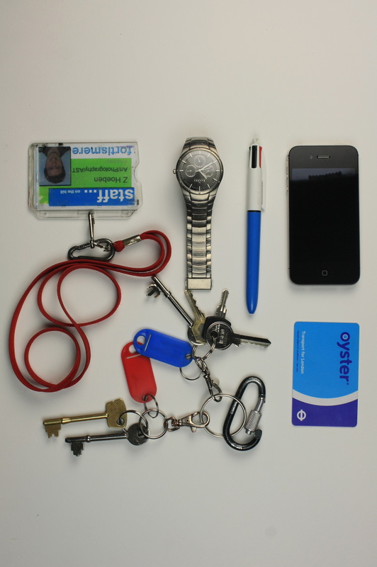
Aims: The aims for this set were to get a range of photos of peoples objects found in their pockets on the day at the time. To photograph them clearly and each layed out in a clear structure where every object was able to be seen and processed. Photos were all taken in a portrait structure then up close in more detail to examine the different things that each person carried. The objects come across in the photos as though they were bein observed or investigated.
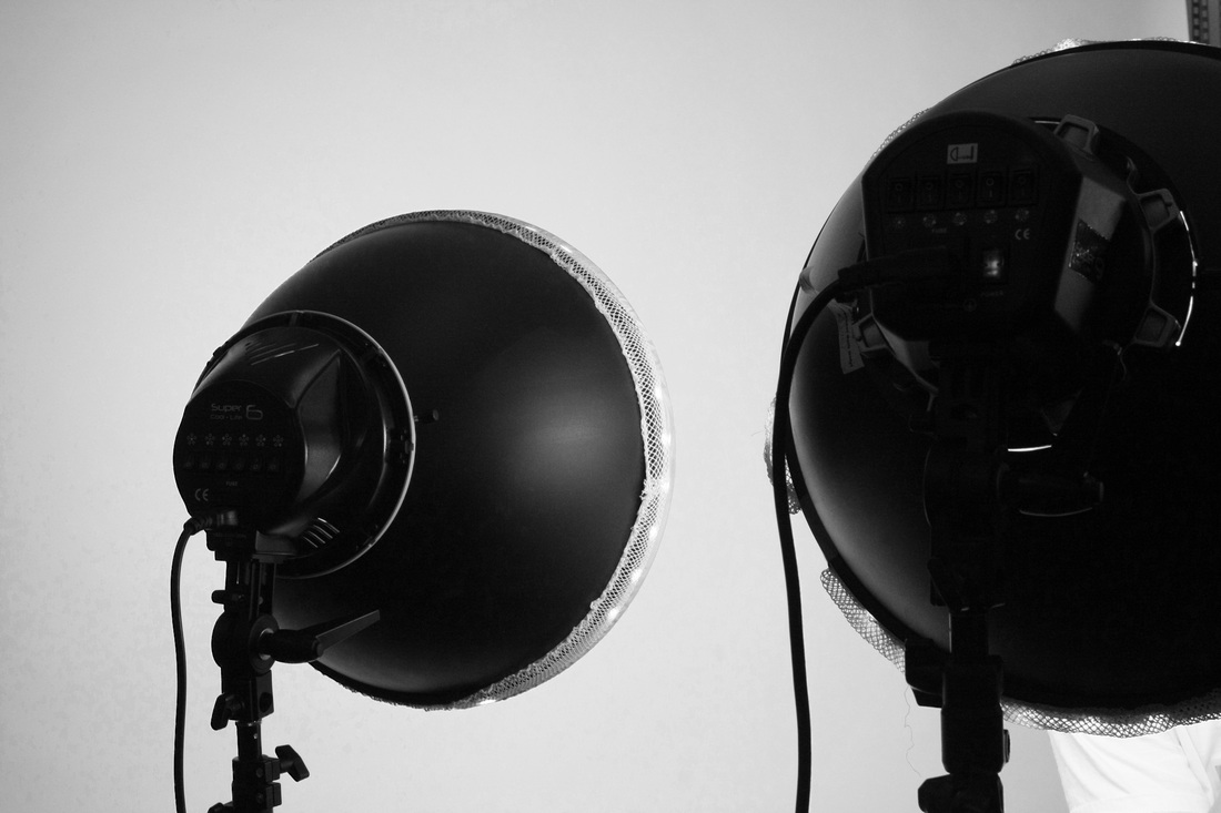
Process: I set up a mini studio across a flat surface and used white card to create a clean, pure background for the objects to sit against. Not anything too busy. I then placed a strong tunstel light above the table shining down on it to illuminate the objects so that every detail could be seen. |
Critque: Shadows are cast across sides of the objects due to the bright light and it not being placed directly center above the table. This also causes white areas to be over exposed and black areas such as the wallet to be darkened even further and washing out detail in texture. In some areas the edges of the card is displayed which makes the photos look unfinished or rushed.
Further Development: To develop this set futher I will make sure that the objects I use to photograph are lit from all sides and no shadows are cast. This could mean using a reflector when shooting. I could also use a bigger space or peice of card to ensure that edges of the card are kept unseen and out of the frame to keep things balanced. To advance this set even further I could try photographing more people and displaying it on a much bigger scale also taking into consideration final outcome ideas when presenting such as on x ray paper or acitate as a forensic study. |
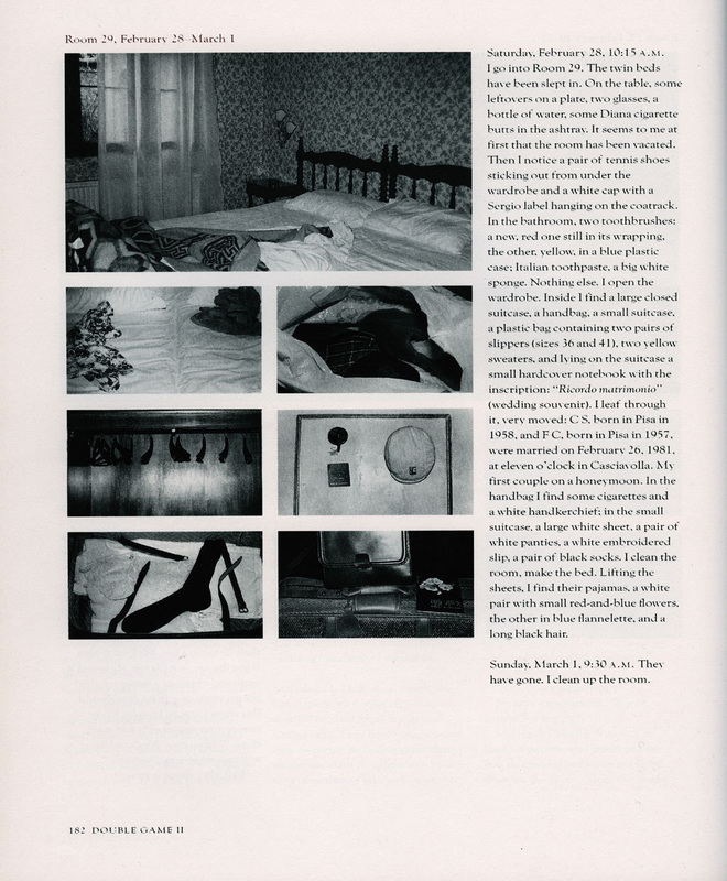
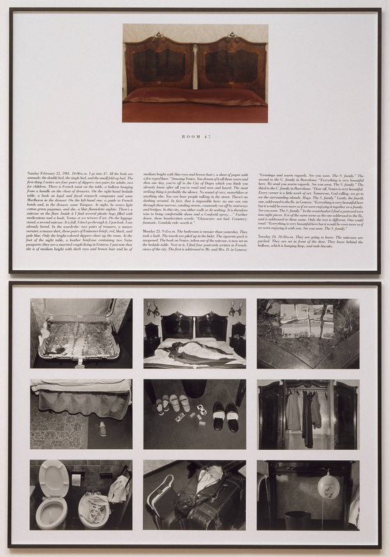
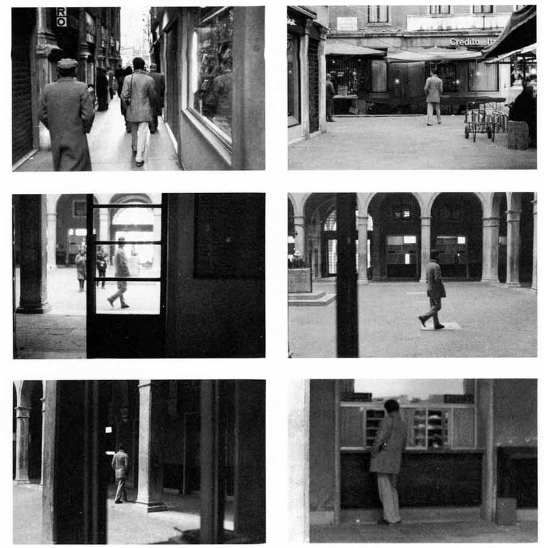
Sophie Calle
Sophie Calle is a French writer, photographer, installation artist. Her work is distinguished by her random and unpredictable sets of constraints, and brings to mind the French literary movement of the 1960s known as Oulipo. Her work frequently depicts human vulnerability, and examines identity and intimacy. She is recognised for her detective-like ability to follow strangers and investigate their private lives walking in the streets or not present in their hotel rooms. Her photographic work often includes panels of text of her own writing and information.
I like Sophie's process of going under cover and her covert style of operation. The way in which she follows one person alone in her photos creates suspense and tention for both the viewer and the subject being followed. Her pictures create a sense of eeriness and people being so unaware. I love the fact that the objects in the photos belonging to subjects and even the people being followed have no idea that they are apart of this project Looking through things that are not yours creates a feeling of guilt and you can also tell alot about someone's personality and who they are just from the things in their room. The task of follwoing someone round in the street is just as tense and again can create an image of who the person is and what they're like.
Set Three: First Response to Sophie Calle
|
Aims: Photograph a room and gain a repeated theme presented through the objects featured in the room or in Sophie Calle's case, gain a sense of personality or an image of someone.
Process: Use a shallow depth of field to really focus on specific obejcts within the room and a quick shutter speed when photographing light coming through a window. After convert all photos to black and white to give a sense of inspection and the ownder's unawareness. |
Crituque: Some photos appear grainy and thereforre need a lower ISO as room was fairly dark in some areas. Focus on more objects which portray the theme and/or act as symbols.
Further Development: Take photos in a better lit room and play with depth of field and a smaller appature. Take photos of peoples houses or bedrooms, a more personal, private space with thinngs that are more special and secret to them. This way when the series is displayed you can try to make connections and ideas about the sort of person that they are. |


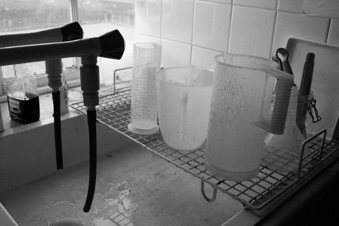
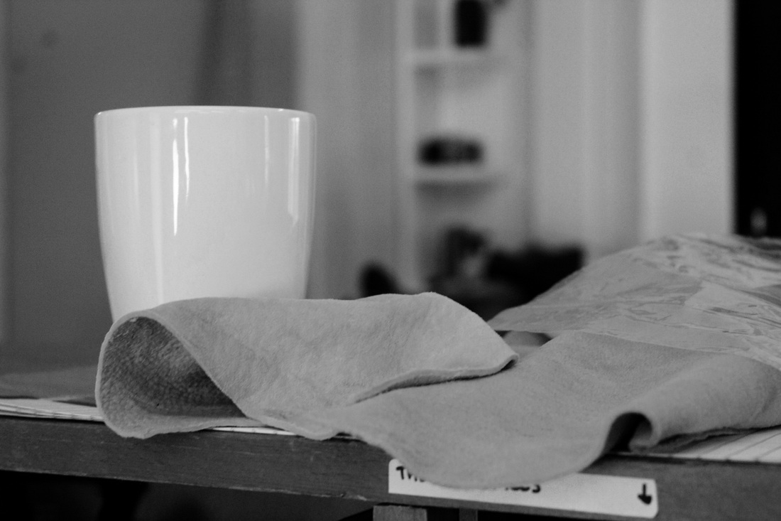
Set Four: Remains in a Cafe
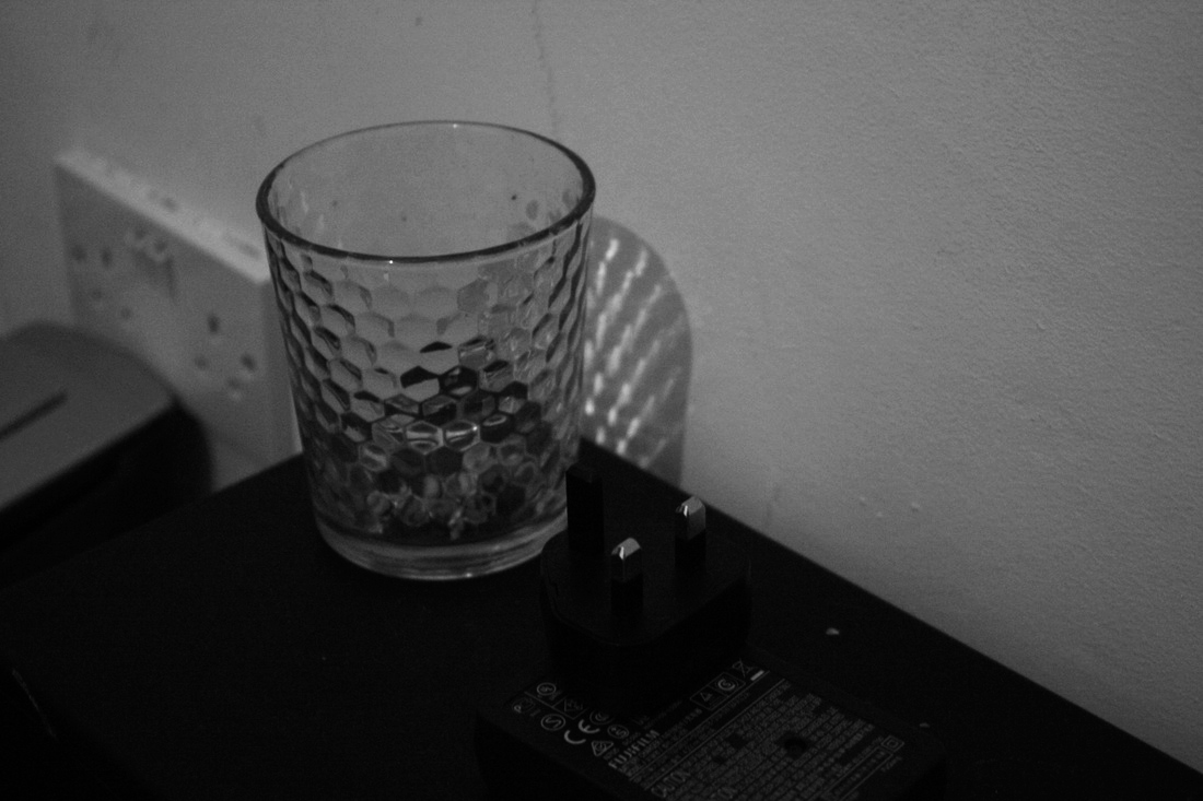
My objectives for this set was again to photograph people without them being there. This meant capturing their traces and the things that they leave behind or have an impact on. Traces are left and discovered by others or sometimes are not found at all. People try to work out who could have or would have been from the clues left behind. You can often figure people out due to footprints or things being left behind.
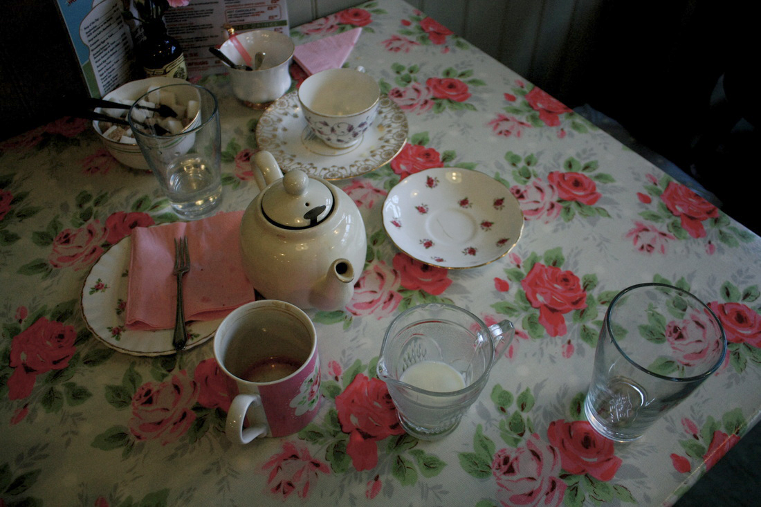
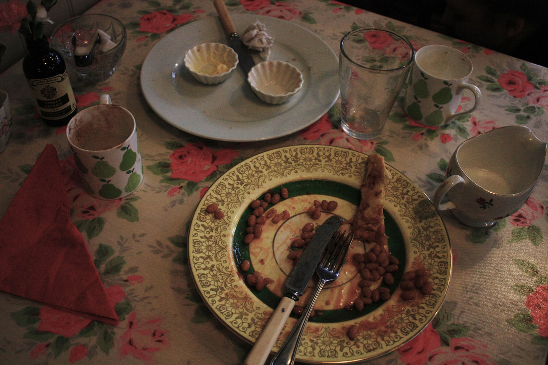
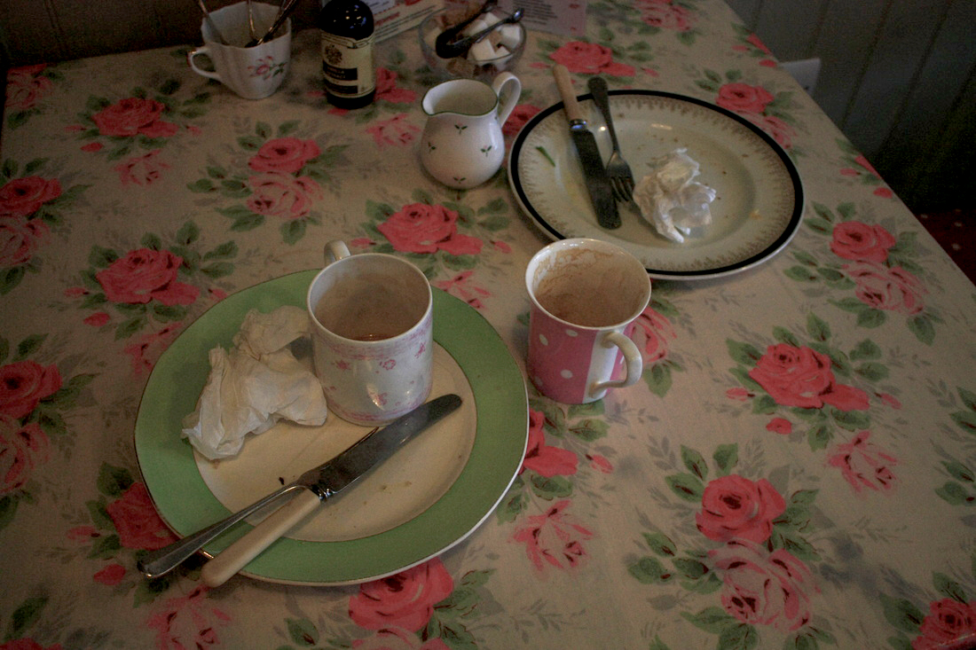
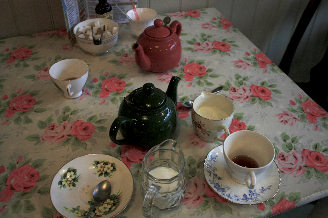

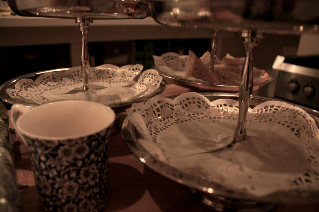
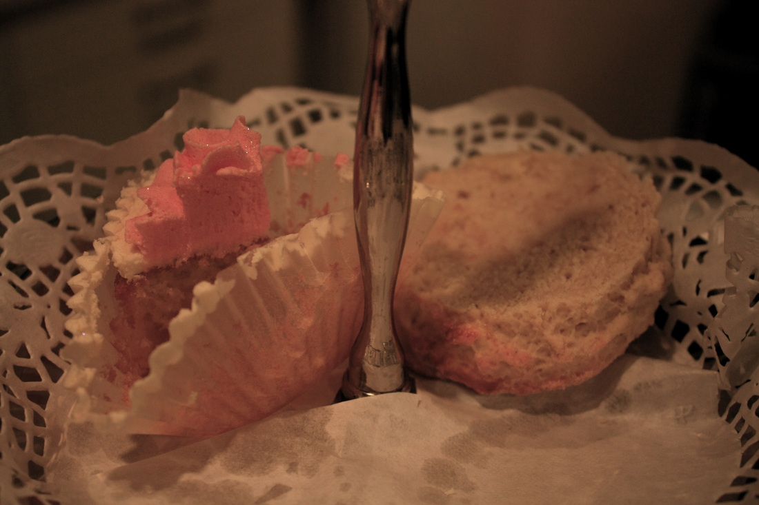
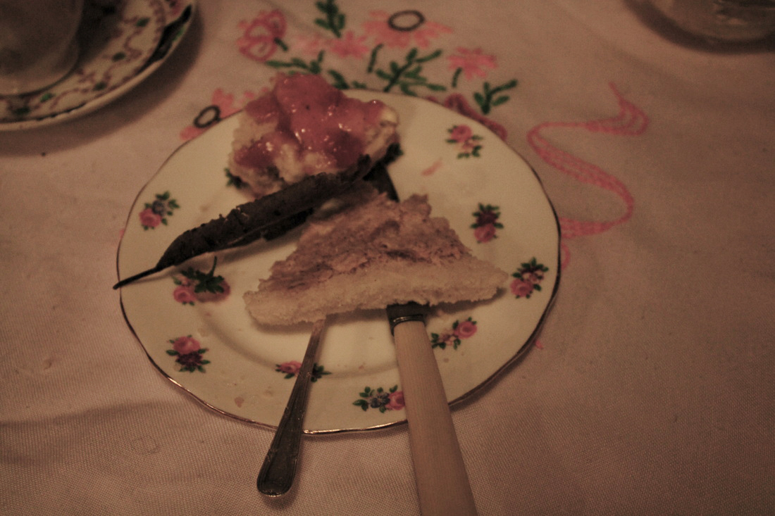
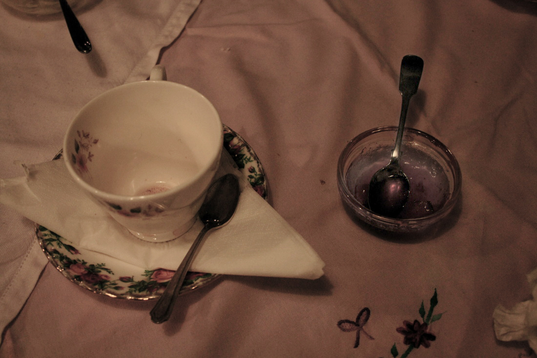
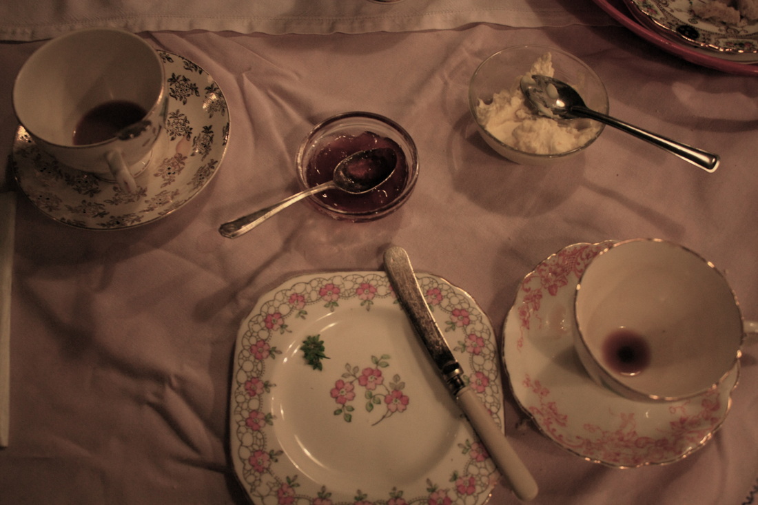
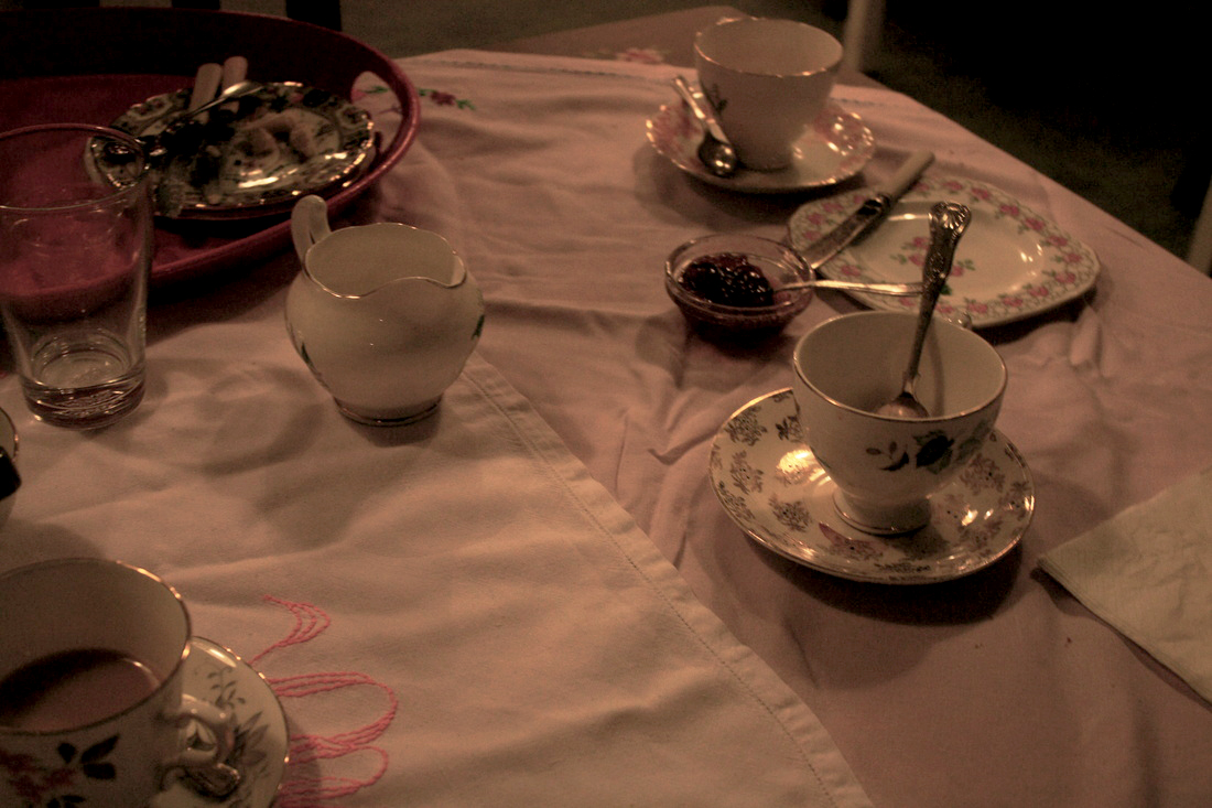
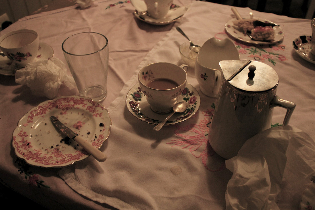
Aims: Photograpgh peoples remains in a cafe e.g plates, glasses, cups, cutttlery, unfinished food to capture their traces.
Process: Whenever someone would leave the cafe before clearing the table I would go out and photograph everything and anything that still remained on the table without it being touched. The shutter speed was very slow as the cafe was quite dim with a wide aperture to get as much food and crockery in focus together. Photos were taken quite close up to capture the the detail of the demolished and unfinished.
Critique: Photos are very dark and large shadows are cast in certain areas. Some photos work better taken close up and others when taken far away with a certain frame and layout.
Further Development: To insure that shadows are not created and that photos are not grainy more light could be added to the room, even natural light if possible. Reflectors would allow light to be bounced back onto objects adding even more light and highlighting objects in more areas.
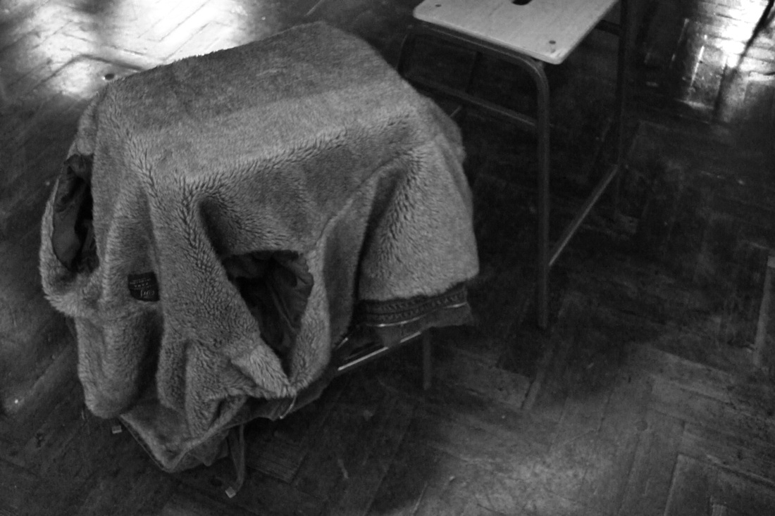
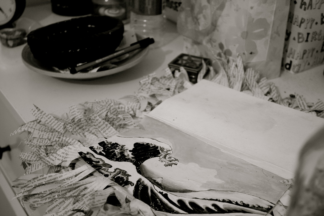
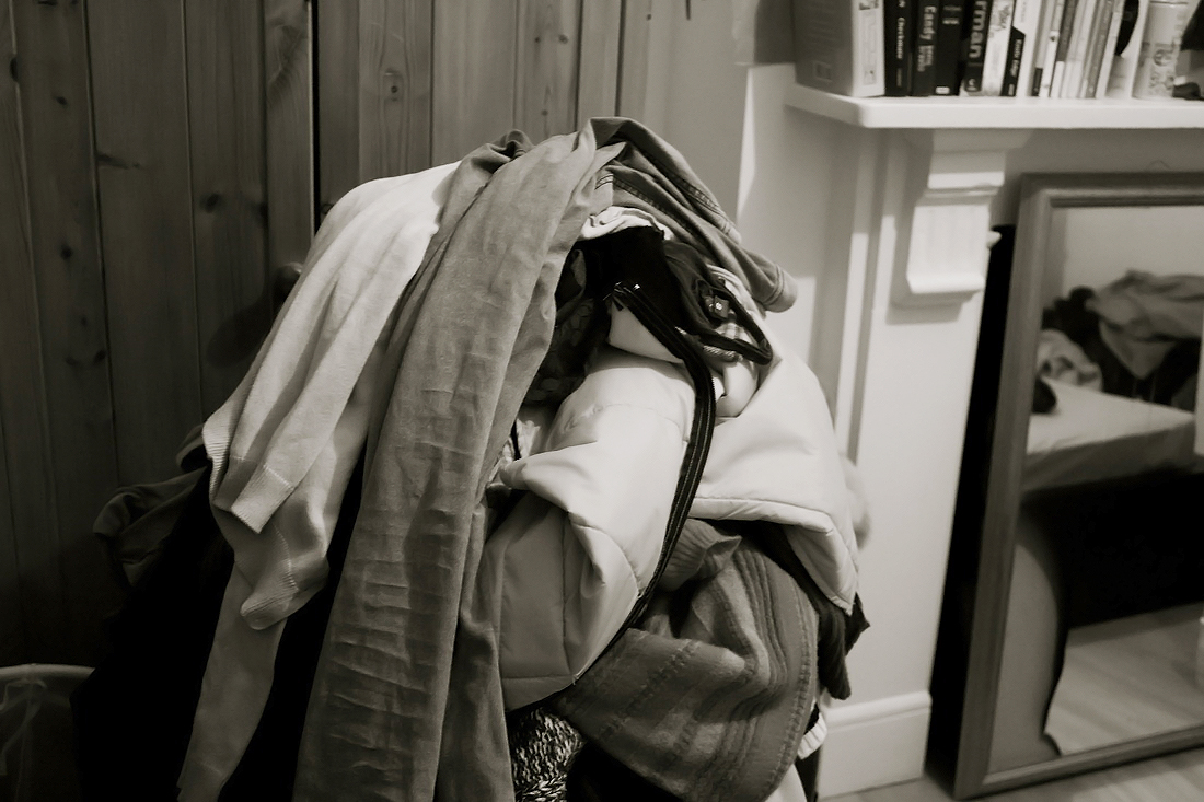
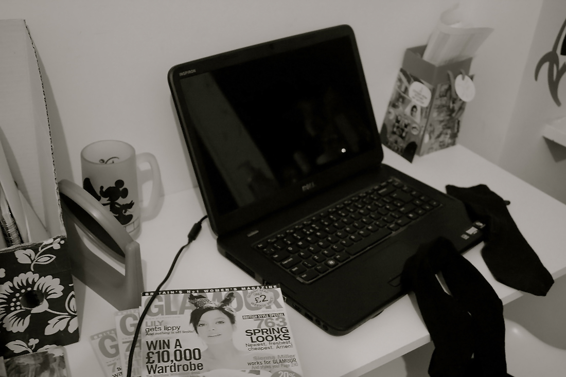
Set Five: Response to Sophie Calle Bedrooms
I decided to respond to one of Sophie Calle's sets to investigate people through the things I could find their rooms. Like Calle I entered without permission and snapped cautiously and quickly to not be discovered.


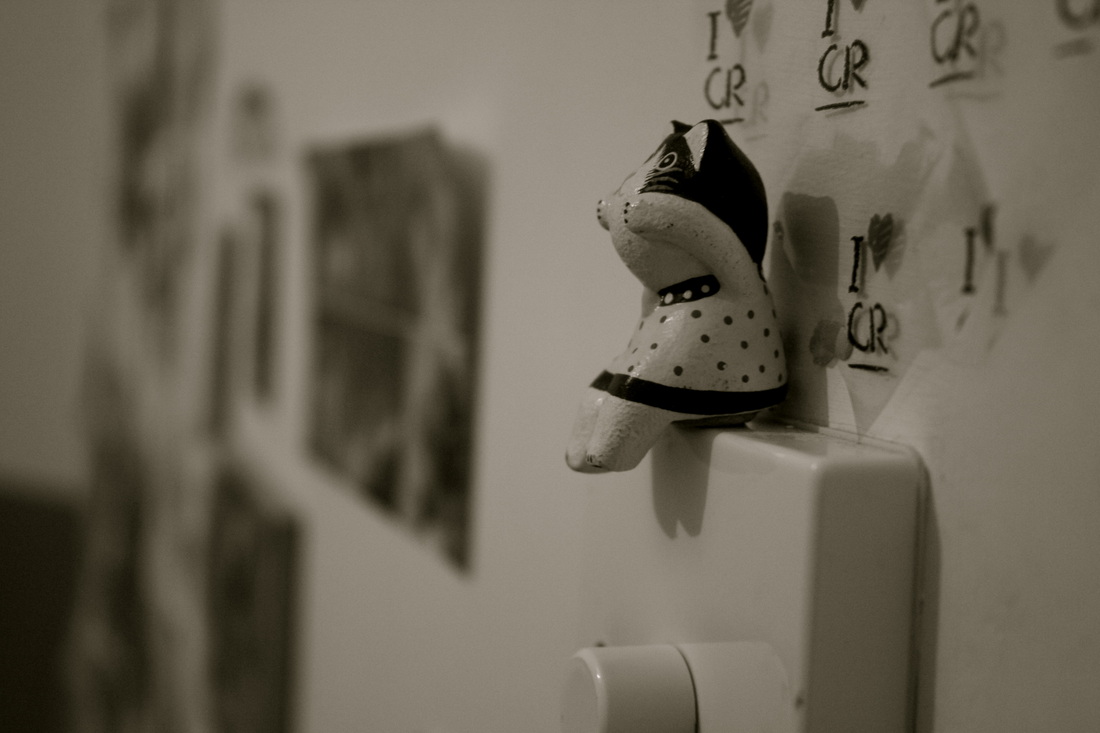
Aims:Photograph my two sisters rooms whilst they are unaware. Focus on trying to gather images of objects which represent them and show aspects of their personalities, likes and hobbies. Who they are.
Process: I lit the room as much as possible and used macro in some cases when getting close ups of objects. I did not want to use such a fast shutter speed otherwise my photos would have been very dark.
Critique: Some photos appear better in black and white and seem more grey in colour which I like. Others appear a bit more yellow or noisy.
Further Development: To develop this set I would need to add more light to the room by bringing in a lamp or taking photos in the afternoon with the curtains open, making the most out of natural light sources. I could also play around more with depth of field to really focus on certain objects that could be more important and stand out from all the rest.


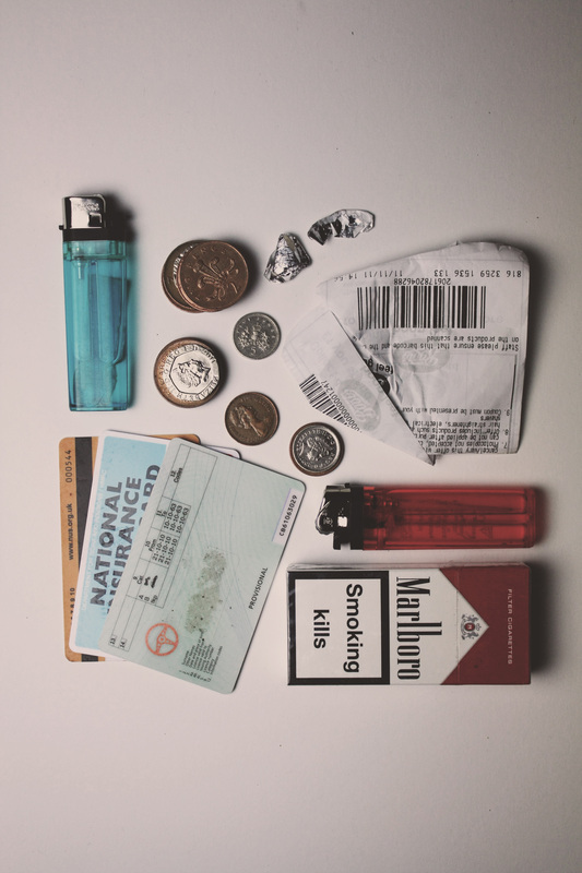
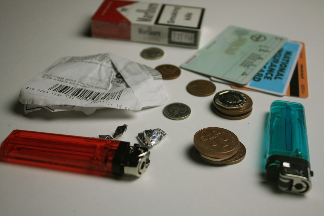
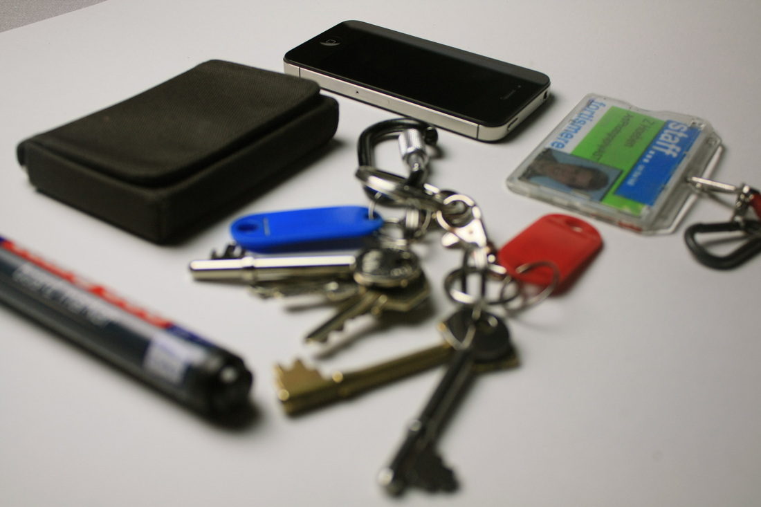
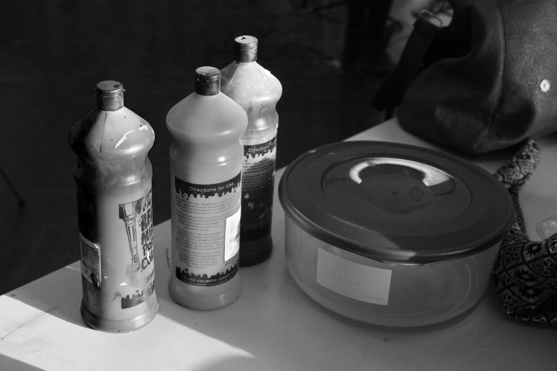
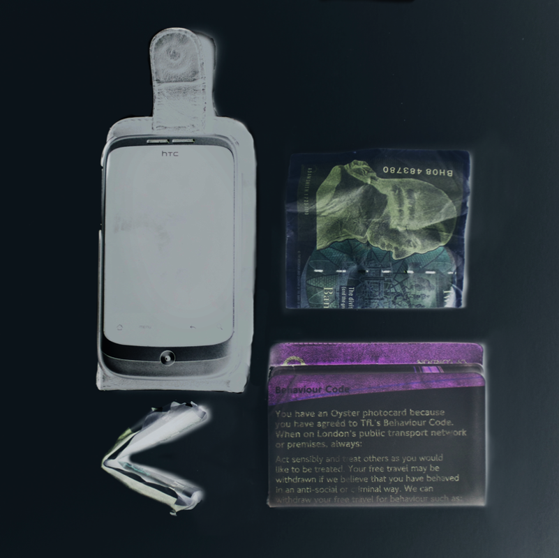
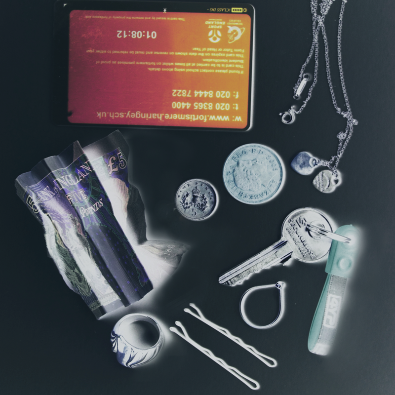
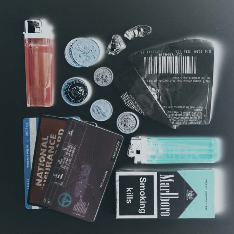
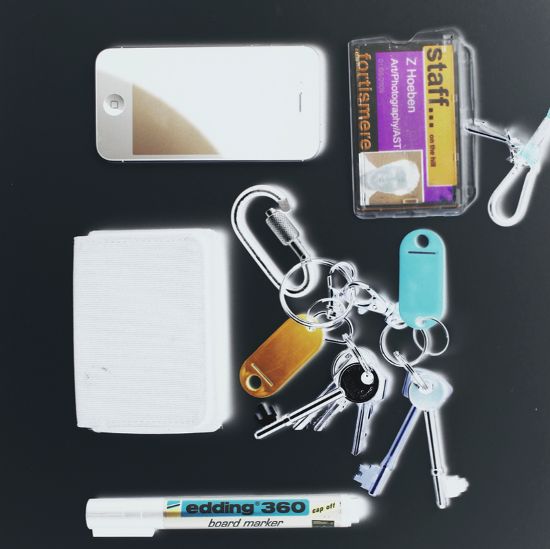
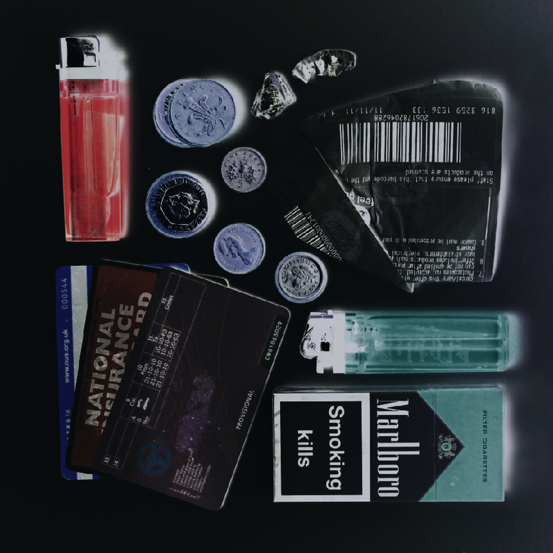
Set Six: More Emptying Pockets


Aims: To develop first set of pocket photos by improving light quality and just trying out new set ups in general.
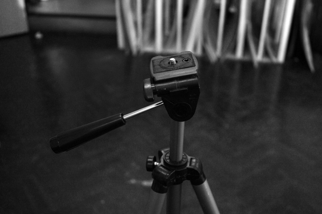
Process: I two used two studio lights projecting down onto a table with white card to create as much light as possible. I used a specific tripod that abled my camera to hang at a high level and focus downwards onto the objects on the table. When setting objects up I used a random layout but tried to keep them all in the shape of a rectangle or square. In some cases I played around with space and lines in order to create a structured but also random display. I used a quick shutter speed as loads of light came in but was sure to not create too make too many shadows appear along with a wide depth of field so that Nothing was out of focus.
Critique: Some photos appear a bit yellow in places and because the way some objects are laid out onto the card not all of object is highlighted and appear darker than others.
Further development: Add even more light, maybe by using a reflector or by adding a third light. There will always be a little shadows in some places but try to work towards eliminated all of them before beginning to photograph. Be careful when placing reflective objects such as keys, money and jewellery to ensure that light does not bounce back into the lens. Maybe also try and find a wider range of objects such as things in bag pockets so the same, classic objects are not repeated over and over again in sets.
Set Seven: Inverted / X-Rays
I felt like my pictures gave off the impression of some sort of inspection or investigation. From this I had the idea to invert them into X-Rays to really highlight objects and their detail but also portray an X-Ray, inspection feel. I thought the photos would maybe come across too dull and certain objects wouldn't represent themselves or be importantly personal when in black and white. I kept them in colour as I felt some colours were very complimentary of each other and it helped give a modern, gadget and personal feel.
Aims: Take photos from previous sets 'Emptying Pockets' and invert them, still keeping the colour.
Process: Using Photoshop I transformed each photo by inverting each picture in layers. I then also added selective colour in specific areas of the photos where I felt certain colours really popped and complimented those around them. Photos are then cropped to a square shape.

Critique: Not all pictures have an even and similar black background. Some are lighter than other. In addition to this objects look and work better together when placed in a square rather than a rectangle.
Further Development: Try and create the same amount of light hitting the white background so when photos are inverted they all have a similar black tone. This could also be altered on Photoshop. Objects should be arranged into a square layout as this work better when presenting things neatly and in order. Croppping them into a square also takes away any excess, empty space.
Further Development: Try and create the same amount of light hitting the white background so when photos are inverted they all have a similar black tone. This could also be altered on Photoshop. Objects should be arranged into a square layout as this work better when presenting things neatly and in order. Croppping them into a square also takes away any excess, empty space.
Set Eight: Black and White
I experimented with presenting my inverted photos in both black and white and colour. I preferred them in colour as I liked how they were more like pop art and gave some life to the life or person they were trying to display. Here are some of prints I inverted in black and white...


|
Aims: Convert pictures into black and white so that they resemble x-rays to experiment with whether they work better without colour.
Process: Using photoshop I inverted each picture. In doing so it automatically converted the photos to black and white. I then adjusted the black and white settings to bring out objects in areas. |
Critique: Photos are very dark and are more black and opaque unlike x-rays which are more grey and translucent.
Further Development: Take more time when editing photos to make them look more visually like x-rays or even to just bring out the detail in objects more so they are more visible. |
Set Nine: Large Prints
I have chosen to present my final prints square and quite large. I think the photos are more interesting and appealing when presented on a large scale with fewer photos rather than loads of small tiny photos. I think having objects small enough to fir in your pockets presented on a small scale would be a boring as audiences would be viewing things just the way they are. I want to invert this with my final outcome and blow up the small things, show their detail and the everyday things we may not always notice.
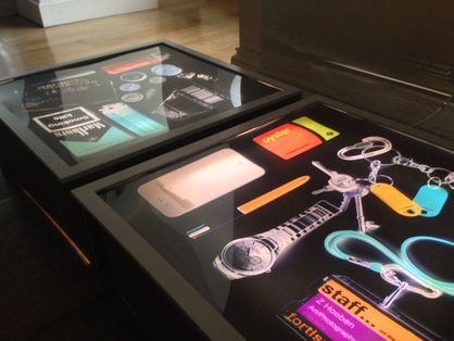
Final Outcome: Light boxes
For my final outcome I would like to produce 2 large square photos across one light box like the examples below. The reason I have chosen to go with this style of presentation is because as mentioned before the photos do resemble some aspects of X-Rays.
Having 2 large square prints would present a magnification of the small objects and would display a close up investigation of 2 different people.
I think having the light coming from behind the photos will really illuminate the bright colours and create bold contrasts against the black background. To make a light box I will follow the steps of this video: http://www.youtube.com/watch?v=OCRzCrsnLnw
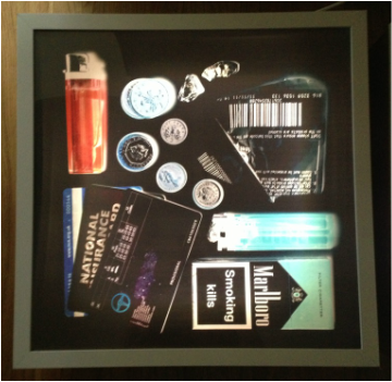
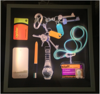
Final Outcome
|
|
Im really proud of my final outcomes for project two. When creating my light boxes I really wanted to enhance the images and increase them to a much larger scale so you can see the objects up close and with great detail. Each box is a square about 50cm wide which I made using MDF. I wanted them to be quite raised as they were to be positioned and displayed on the ground. I purchased some stripped, white, LED lighting and attached one strip to the inside of each wall of each box producing as much light as possible allowing the colours of the images to really pop and be highlighted in their negative effect. When framing the images I chose a white frame to contrast against the images dark background to border them solidly.
I am very pleased with my finished outcome and think in the dark with the light from inside the boxes on, it really does the images justice with their bold neon colours the oranges and blues really stand out. Again the detail of the objects can be seen much clearer now as the small, everyday objects are presented on a much bigger scale. Each box represents two different people and from the colours and objects viewers will construct different images of the kind of people they might belong to or create certain hobbies that they might enjoy or career they may have etc.
I am very pleased with my finished outcome and think in the dark with the light from inside the boxes on, it really does the images justice with their bold neon colours the oranges and blues really stand out. Again the detail of the objects can be seen much clearer now as the small, everyday objects are presented on a much bigger scale. Each box represents two different people and from the colours and objects viewers will construct different images of the kind of people they might belong to or create certain hobbies that they might enjoy or career they may have etc.